


Responsive website

City Cycles is a local bike rental business that offers different bike styles and options for all age groups and activities to make their experience more enjoyable and memorable.
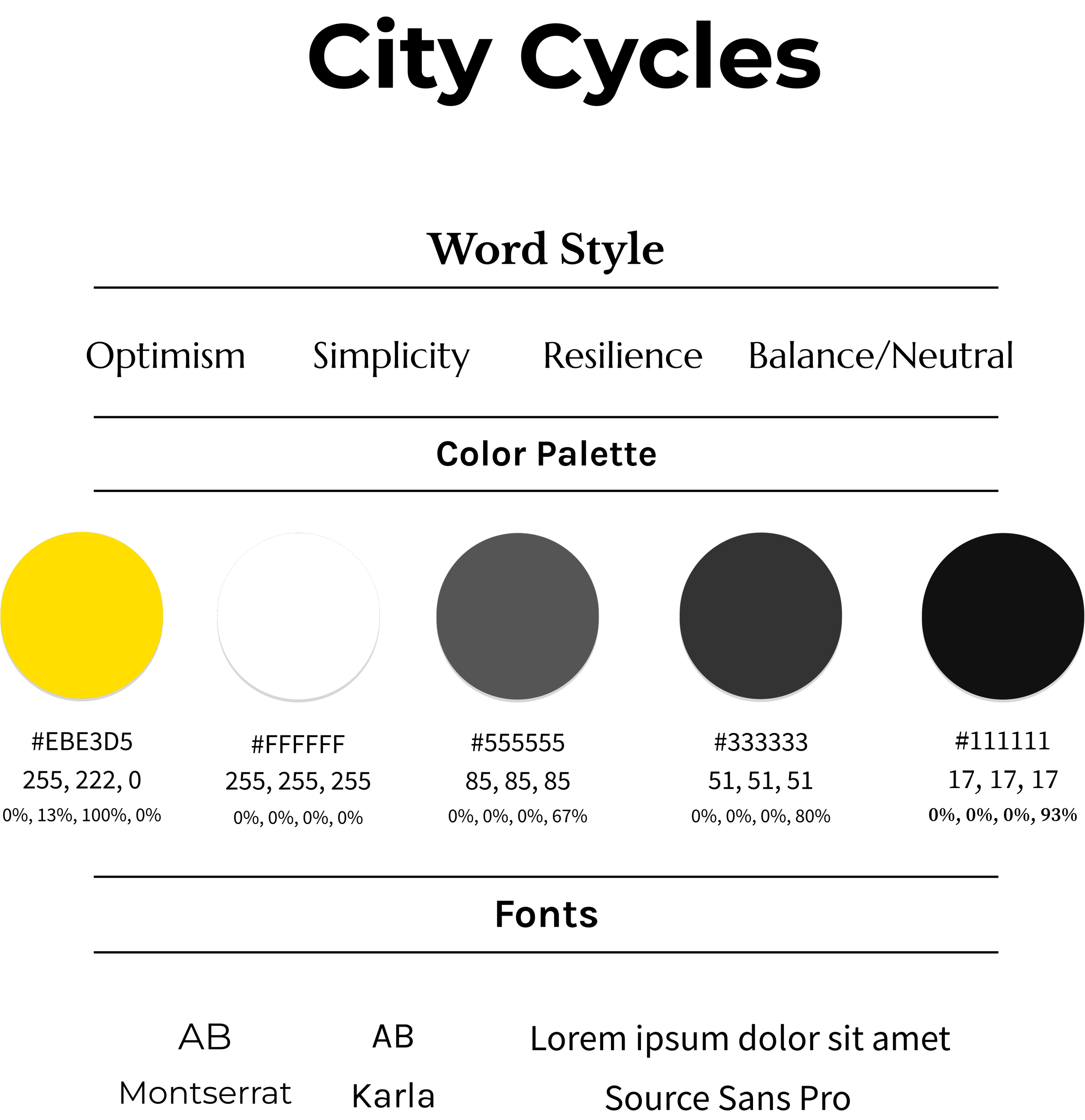
City Cycles
SUMMARY
The overall concept of this project was to effectively modernize a website for a family business that has been operating since 1993. Despite the recent updates by the owner Mimi, the modifications caused an issue for her customers to efficiently make bike reservations. After the website was restructured, organized, with special effects a customer analysis software was used to monitor the results for the company. After five months of monitoring customer traffic and interaction, City Cycles reached their goal by regaining 80% clientele back to making bike reservations on their website.
Role: Web Designer (UX/UI designer)
Timeline: 04/04/2023 - 10/04/2023
Tools used: Figma & Analysis tool
CONTEXT
City Cycles is an established business that provides bike rentals for the community since 1993. Their goal is to ensure that their customers have the best experience when using their products and services.
“We want you to have a wheelie great experience – from the time you visit to our shop, to when you are spinning around the city.” - Owner Mimi

PROBLEM
The owner, Mimi is trying to see why customers aren’t using the City Cycles’ website to rent a bike. The challenge is that users struggle to find a way to rent bikes on her website. The website was outdated and wasn’t user friendly. So, the customers’ alternative was making reservations over the phone.
MY ROLE
As a Website Designer, I was hired to identify all issues and find solutions to recover 80% of City Cycle’s customers to make bike reservations through the website. But the major question is how might City Cycles encourage customers to rent bikes on their website?
SOLUTION
The solution is reconstructing the entire City Cycles’ website and prioritize a "Click Here," button to facilitate seamless online bike rentals for customers. In theory this approach is anticipated, to recover up to 80% of customers who may otherwise abandon the site.
Interview Questionaries
UX SWOT Analysis
Sitemap
Customer analysis software
To get data for the best results to solve this problem I used:
Emphasize → Analyze/Research → Ideate/Design → Prototype → Test → Reflect/Growth
Breakdown of the process:
EMPATHIZE
Most customers were frustrated because of how confusing the website was. Several individuals emphasized the challenges associated with the bike booking process, which led many to make reservations via phone.
ANALYZE/RESEARCH
During my research, I interviewed 24 people ages 18-45 who were athletes, tourists, families, and friends willing to participate in the questionnaire interview process. This process was important to get customer’s insights on their experience trying to make a bike reservation on the City Cycles’s website.
Questions to customers who use City Cycles’s services to rent a bicycle:
How did you discover City Cycles and how long have you been using their services?
What are the reasons you may book to rent a bike?
What changes do you think the site can improve on to make the experience easier for you to maneuver through?
Would you recommend anyone that never heard of this business to become a customer?
Insights: Customers are ready for changes to the City Cycles’s in hopes for a better rental experience.
1. Many of them discovered City Cycles through family and friends. Others discovered City Cycles through finding bike rentals online. A few accidentally came across the company while heading to a specific place.
2. Six people said that they have always remembered being a customer of City Cycles as children since their family were loved the outdoors. Ten use City Cycles for healthy, cardio-focused activities. Three rent bikes for temporary transport, while five ride as a hobby.
3. There was a common response that many customers had was the lack of appeal of the website and the challenges of making bike reservations. Also, some of the information doesn’t match to their designated page which caused confusion to customers.
4. Majority of the participants said they would recommend the business to family, friends, coworkers, and those who wants to tour the landscape by cycling.
City Cyles’s UX SWOT Analysis
To assist me in developing strategies aimed at enhancing the website, I used a SWOT analysis. This approach would help me identify the company's strengths, weaknesses, opportunities, and threats. The objective was to find the best result to improve a better experience for customers.
STRENGTHS
The owner Mimi has a short background story of City Cycles on her website to connect with her customers.
City Cycles information was straight to the point. But now it is about executing the message more effectively.
WEAKNESS
Customers are facing a challenge with making bike reservations on the City Cycles’s website.
The color choices as blend in with the background to where it is hard to read important information.
City Cycle’s website looks rushed and unorganized which can cause the business to appear inadequate, illegitimate to their target audience.
OPPORTUNITIES
Create a design that features engaging visuals to maintain customers' interest while surfing on website.
Create a more efficient and convenient route for customers to make bike reservations.
Removing certain pages, renaming tabs, articles, and pictures that do not reflect an upscale bike company and enhancing the overall look and experience by implementing high-quality images, pictures, videos, reviews to improve visual appeal.
THREATS


City Cycles is losing 80% of customers to make bike reservations, due to the difficulties faced by users when navigating their website.
The topics and articles do not correspond with each other or aligned with the specific tab on the navigation bar which can cause confusion among their customers.
Original Website Overview: Reorganizing the structure of the website and design an efficient route that will enable customers to rental bikes effectively.
The first thing that I noticed was the background flex effect of a bike which was an immediate distraction from important content for users to read. Furthermore, I noticed that the content displayed was not aligned for the home page but more so for an about page. Nevertheless, I still needed to determine how to effectively incorporate their background story into the new website design.
When I went to the Blog page, I noticed that it is was equally distracting as the homepage. The first and second half of the page featured background images that were distracting, making it difficult to read passages. Additionally, the "Leave a Comment" section, intended for customer engagement, was awkwardly placed over an image of a couple.
The second half of the page contain the blog content; however, I was immediately confused by reading two distinct titles seeming to share the same passage, which appeared unrelated. On the right side of the passage was a search bar, which was easily overlooked due to its blending into the background image of a bicycle.
It was concluded that I had two options to recreate the Blog page layout either include an "About" tab in the navigation bar, which would require me to develop a dedicated About page, or redesign the entire Blog page to align titles with their respective stories.

The Hours page was the last page which also had the same distracting background image. The Hours page consisted of the City Cycles’s office hours, a search bar, office number, their social media and an unnecessary like button. I knew that the contact page would be easier to design since the main focal points is contact information than having extravagant visuals for appeal.
After careful observation of the website, I was inspired to incorporate the background parallel effects, aligning with their original intent. However, I wanted to still ensure to appropriately implement this effect while also avoiding unnecessary distractions from reading critical content for customers. The concept was to design a website was not only feature significant movement to reflect the themes of cycling and outdoor activity but also display bike option choices for different age groups while maintaining a more unisex and futuristic aesthetic.
City Cycles’s Sitemap

I decided to use a sitemap method to create a more organized structure for the redesign of the City Cycles’s website. First, I reconstructed and relabeled the navigation’s tabs to Home tab, Bicycle’s tab which includes subtabs of different age groups would be implemented, Rules tab, and a Contact tab.
But the primary focus of this project was to redesign City Cycles’s website so that it is making bike reservations more accessible and efficient for customers from the unnecessary difficulties in navigation. I decided to incorporate a reservation section on the homepage. Once they hit the Reservation button it will navigate customers to that designation page.
The process of developing a range of wireframes presented certain challenges. Although I wanted layers, specifically for the home page, I didn’t want it to be overwhelming that would potentially overshadow the smaller segments of text that are equally significant for the customers to read. Another challenge was how creating designs of the other pages in a manner that allowed each to have their own distinctive style while still being cohesion with the homepage. Furthermore, it was important to prevent excessive visual distractions for a seamless and simplified design approach to ensure that the customer experience remained clear and focused.
Wireframe

Navigation bar (Hamburger menu)
Minor adjustments to the navigation bar were implemented by adding two additional tabs: Rules tab and Bicycles tab. The tab previously labeled "City Cycles" was renamed to "Home," and the "Hours" tab was renamed to "Contact." All five tabs were positioned in the center of the navigation, since the search magnifying glass icon, the profile icon, and the cart icon was now included and positioned on the right side of the navigation bar.
Home page
Once the user accesses the City Cycles’s website, they will be presented to a video of people riding on City Cycle’s bikes. This is a great introduction to effectively capture potential customers to want to further explore the website.
As users scroll downward, instructions on how to make reservations will appear on the screen. This feature to provide essential information efficiently, without having to do intensive research or taking too much time to find the information.
Information about background history about the business will appear as users scroll down and a more efficient and direct way of making reservations which was the main issue that City Cycle wanted to resolve.
Main Category pages (Adults, Teens and kids, and Toddlers)
The original website layout did not have categories of bikes that were appropriate for each age groups and the website did not display any bikes that City Cycle offered. So, I developed three primary pages for three distinct age groups: Adults, Teens and Kids, and Toddlers. Each of the three main categories showcases the different bikes and their names. rated reviews, and price. This improvement enhanced the website's organizational structure while providing customers with convenient access to options for selecting bicycles tailored to their specific requirements.
Adults, Teens and kids, and Toddlers pages
Users now have the ability hit on one of the previews of the bikes that were showcased on the main category page. Once a customer hit one of the option choices displayed, they will see additional information about the bike that is presented, including details about the special services offered by City Cycles, a comprehensive description about the bike, and the option to select the desired bike size before making a purchase.
Blog page
The Blog page was completely reconstructed with the one of the titles I took from the original blog page and the article that was more aligned with it. At the last minute I was told to add three more articles that customers can read once they were released by the company. I had an idea to implement a visual effect so that the three articles would be displayed in greyed-out form, indicating to users that the other blogs are not accessible to read until they are full release.
Sign-up/Log-in account page
The original City Cycles website did not provide an option for customers to create an account in order to sign-in. Now customers have the option to create an account for a more personalize user experience.
Cart page
The cart page was included into the new website with more simplistic in visibility in comparison to the other pages. Because the main focal point was providing the customers control over adjusting the quantity of the items they intend to rent.
Contact page
The Contact page was reconstructed based on the original layout design, which had lacked hierarchy and alignment. In the initial design, it was designated as the "Hours" page and only contained the front desk office number along with the business hours. Now the tab originally labeled "Hours” is renamed to "Contact," and the page has been revised to include the office address, business hours, an option to email the company, in addition to the existing contact via the office telephone number.
Mockup
IDEATE/DESIGNS
The design concept was to implement a user interaction while maintaining a balanced, cohesive aesthetic, and a more seamless visual experience for City Cycles' website. The color scheme was changed to neutral tones to establish a modern, futuristic aesthetic to promote an inclusive environment for customers.
1. Color theme - Neutral colors black, dark gray, white was selected for neutrality, readability, and balance. An accent of yellow was incorporated to emphasize key elements which would attract the user's attention.
schemecolor.com
2. Shape - None
3. Font theme - Geometric sans-serif, Grotesque serif, and San-serif for legibility, clean finish and a more modern vibe
4. Pictures/illustrations - People riding bikes and showcasing different types of bikes for different activities and age groups.
5. Easy user-interaction effects - Audio buttons to mute or unmute homepage introduction video, checkmark, parallax effect and fade in tool when scrolling down, zoom-in pictures on the home page, options to select bike sizes.


PROTOTYPE
Navigation bar
The navigation bar now exhibits a special effect whereby the background is initially translucent but transitions to black once the user scrolls downward, specifically on the homepage.
Home page
The website's introduction consists of twenty-four-second video showcasing individuals riding City Cycles bicycles, which automatically plays when a user accesses the site. Users have the option to mute or unmute the video's audio at their discretion.
As the user scrolls downward, the instructions for making reservations gradually transition into view.
More visual effects are introduced as the user continues scrolling, with images in the "Our Services" section moving into the scene accompanied by fading-in descriptions, allowing users to read about the company's services.
Underneath “Our Services,” section is an animated bike moves into view next to the Reservation title, subtitle, and a button. when they hit ithe “Click Here,’ button, it navigates the users to the reservation page, where they can proceed with booking before purchasing their bicycle.
Reservation page
On the reservation page, customers are required to input their first and last names, email address, and contact number in order to register. Then they are presented with various available time slots available for scheduling. Once their information is confirmed to be accurate, they must click the "Enter" button to complete the registration process in order to proceed which enables them to select the specific bicycle they wish to rent.
Cart page
Once a customer is in the cart to make a purchase, they have the option to increase a particular bike in the cart or decrease the number amount, once they hit checkout, they would have officially paid for their bike reservations.
Once a customer has added a bicycle to their shopping cart, they have the option to increase or decrease the quantity of that particular bike item. Once they proceed with the purchase by clicking the “Checkout,” button payment will be officially processed for their bicycle reservations.

TESTING
Final Step: Personal website did make a positive impact with customers
The final assessment involved a customer analysis software to monitor customer traffic for the next three months. This analysis would serve as an indicator of the users' satisfaction with the company’s personal website and overall experience.

SEGMENT - 2022
BEFORE - Clientele (20%)
Mimi’s website lacked engagement rates, interactive behaviors, and user interests since 2020. Although it has slowly progressed the last 4 years, it hasn’t seen much momentum as expected because of an outdated website that became a challenge for people to make reservations which caused 80% loss of her clientele.
BEFORE - Engagement Rate (22%)
Many clients began to make phone reservations which caused a high volume of calls and inconvenience of waiting period for bike reservations. Furthermore, some clients chose to visit the City Cycles’s in person, saying the website was "too difficult to navigate," which contributed to an 80% decline.
SEGMENT - 2023
AFTER - Clientele (80%)
Mimi was able to attract and prioritize a "Click Here," button to facilitate seamless online bike rentals for customers. This approach helped to recover up to 80% of customers who may otherwise abandon the site.
AFTER - Engagement Rate (61%)
After reconstructing, organizing, and better visuals for the entire City Cycles’ website, pages became easier to navigate to specific pages of interest. This improvement exhibited an increase by 61% in engagement rate.
REFLECT & GROWTH
The goal of this project was to assist City Cycles on how to keep 80% of users from leaving their website to rent bicycles. The problem was the lacked of organization to each tabs corresponding pages. This caused complications on how to rent a bike more effectively. Another problem were the background distractions which could cause someone who have eye impairment to miss elements, such as their search bar, section to comment that blended in with the background. The website had to be restructured, organized and effectively create a route for customers to rent bike easily on the website.
During my research, a questionnaire interview was used to document the opinions and experiences of 24 customers who use City Cycles services. A UX SWOT Analysis was used to identify key elements to help me find a better concept to create a more polished website. Additionally, a sitemap method was used for organization and user navigation for a more user-friendly experience. The challenge was maintaining the original concept of the website but elevated it more with content and special effects. Another issue was the website didn’t display any bikes or varies bikes for customers to have the option to choose from for any age group or activities. It was important that I created a website engaging and having the choice with the product they purchase.
What I have learned through this project is a company’s website should always be useable for customers. City Cycles website wasn’t convenient when it came to customers renting a bike on their website. Additionally, the bicycle background image was distracting, as it overshadowed other elements on each page. Once the website was remodeled with better special effects, organization of page content were changed, and a more efficient way for customers to make bike reservations, a customer analysis software was used to monitor any improvements with her customers. After five months of monitoring customer traffic and interaction, City Cycles was able to reach their goal by regaining 80% clientele back to making bike reservations on their website.