Responsive Website
A website platform that displays information pertaining to music, festivals, and upcoming and upcoming events happening worldwide.
Festival Travelers
SUMMARY
The overall concept of this project was to gain more user interest, user engagement and interactive behaviors on the Festival Travelers’s website which showcased upcoming festivals and events locally, nationally, and internationally. But the simplistic of visual appeal of the website and the lack of organization navigating users to the corresponding page caused many to lose interest in what the site had to offer. By reconstructing, organizing, enhance the visual appeal and implementing features such as a gallery of festival topics, hover effects, and a contact page regarding inquiries, feedback, or concerns has increase by 30% of customers’ interest and engagement.
Role: Web Designer (UX/UI designer)
Timeline: 03/16/2025 - 07/31/2025
Tools used: Figma & Analysis tool
CONTEXT
Mark T. Green is the founder and editor of the Festival Travelers’s website. The website provides updates on specialized festival, musical events, whether national or international for audiences who are interested in musical performances and festival culture.
PROBLEM
Although Festival Travelers offers information about upcoming events for users, the website suffers from poor and repetitive navigational structure. Some of the options on the navigation bar and layout were not aligned and unclear, making it hard for visitors to find what they were looking for. Also, the simplistic design of the website didn’t match the lively, fun vibe of the events it was promoting. Because of this, fewer people were interested in what the site had to offer.
MY ROLE
As a Website Designer, I was hired by Mark T. Green to reconstruct, organize, and enhance the visual appeal of his Festival Travelers website. The goal was to find ways to attract the user interest, increase user engagement, and interactive behaviors.
How might we effectively increase and maintain the target audience interest to encourage the participation of surfing and being interactive on the platform?
SOLUTION
The solution is to create a strong presentation to maintain user interest, increase visibility appeal, efficient navigational structure, and stimulate customer engagement and interactions on the Festival Travelers website.
Interview Questionaries
Empathy map
Word cloud
Customer analysis software
To get data for the best results to solve this problem I used:
Emphasize → Analyze/Research → Ideate/Design → Prototype → Test → Reflect/Growth
Breakdown of the process:
EMPATHIZE
Festival Travelers must adopt a strategic and targeted approach to effectively engage their intended audience without causing information overload. When users go on the navigation bar for a specific topic, they were directed to a page that wasn’t aligned. This caused confusion and a lack in confidence when browsing and finding options they were interested in. Festival Travelers website lacked visual appeal and the disconnect with the information provided to retain the user’s attention.
ANALYZE/RESEARCH
During my research, I interviewed 15 people ages 18-50 who are into music, festivals, and traveling to gain insights on their overall experiences as users on Festival Travelers website.
Questions directed to users who regularly access the Festival Travelers’s website for event updates:
Do you think Festival Travelers can give a better experience for customers?
Do you prefer going into a blog that deals with concerts and festivals in your state, your country, or internationally?
On a scale of 1-10, how satisfied is your experience surfing Festival Travelers’s website?
How do you want to feel or look when you are on a blog website that showcases concerts, festivals, and traveling?
1. Every person that was interviewed stated that the website could have been better organized and aligned with the article’s topic. They also felt that the website could have had more visual appeal when maneuvering through the website.
Insights: Users wanted a better experience when using the Festival Travelers’s website
2. The majority agreed that they wouldn’t mind going to a website that showcased concerts and festivals in either their state, country, or internationally.
3. Five people preferred seeing concerts and festivals that’s scheduled to arrive in their state or country. Six people felt indifference knowing about events in the same state, country, or internationally. The last four said that they would prefer seeing events within their state.
4. Some said that they want to have the excitement to see the events that will be coming soon. Others said they want to feel like they are there at a festival or concert, especially if they do not have the money.
I chose Brady, a college graduate, who was one of the participants from the interviews to give me feedback about his experience while on the Festival Travelers website. The goal was to pinpoint factors which influenced decision-making in the redesign of the Festival Travelers platform. Therefore, an empathy method was used to gain understanding and identify the possible needs for users.
Festival Travelers’s Empathy Map
Why is there two home pages? When I hit the logo on the navigation bar, a home page appears. But when I hit the “Start Here,” tab it looks like a second home page.
Looks like something happen to the pictures on the page that talks about earphones. It isn’t showing up on the screen even when I hit the refresh button, nothing seems to work.
Is there a way to contact the founder or anyone that could be working for this blog? I do not see a way to contact them.
SAYS
The website looks unfinished and it should be more appealing since this is all about festivals and events.
I think that this website is dull and unappealing.
I believe that I can find better websites to go to pertaining to festivals, events and even concerts.
THINKS
Brady clicked a city on the upcoming events list but was confused. He realized it was just a list of cities displayed.
Brady would click on an article but quickly seem disinterested in reading the entire page.
He clicked on the link to read more information about an earphone that goes to Amazon.
He clicked on the “Brand Partnership,” tab but it seems to be a broken link, or a page was never created.
DOES
Brady seems to get bored, uninterested and disengaged while surfing through the website.
He looked confused with the website layout and navigating to certain pages of interest.
FEELS
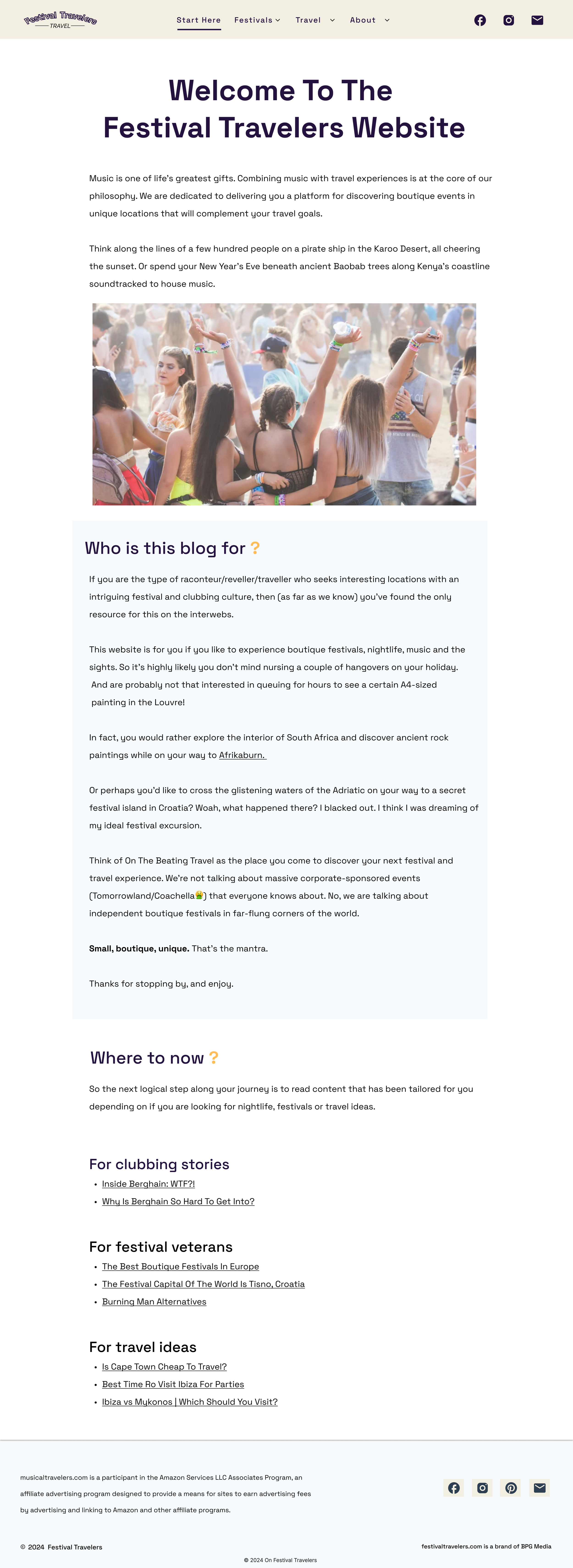
In the Festival Travelers’s original website, the navigation bar consisted of: Start Here tab, Festivals tab, Travel tab, and the About tab. But there was instant confusion since the Start Here tab seem like the (second) homepage. The About tab had sub-tabs of Blog and Brand Partnership which had no correlation about the Festival Travelers website and the Founder of the website. It was concluded, make quick adjustments to the navigation bar’s by renaming the Start Here tab to Home tab, and include the About tab, Blogs tab, and the Contact tab.
Original Website Overview: Website Remodel and Reconstruction
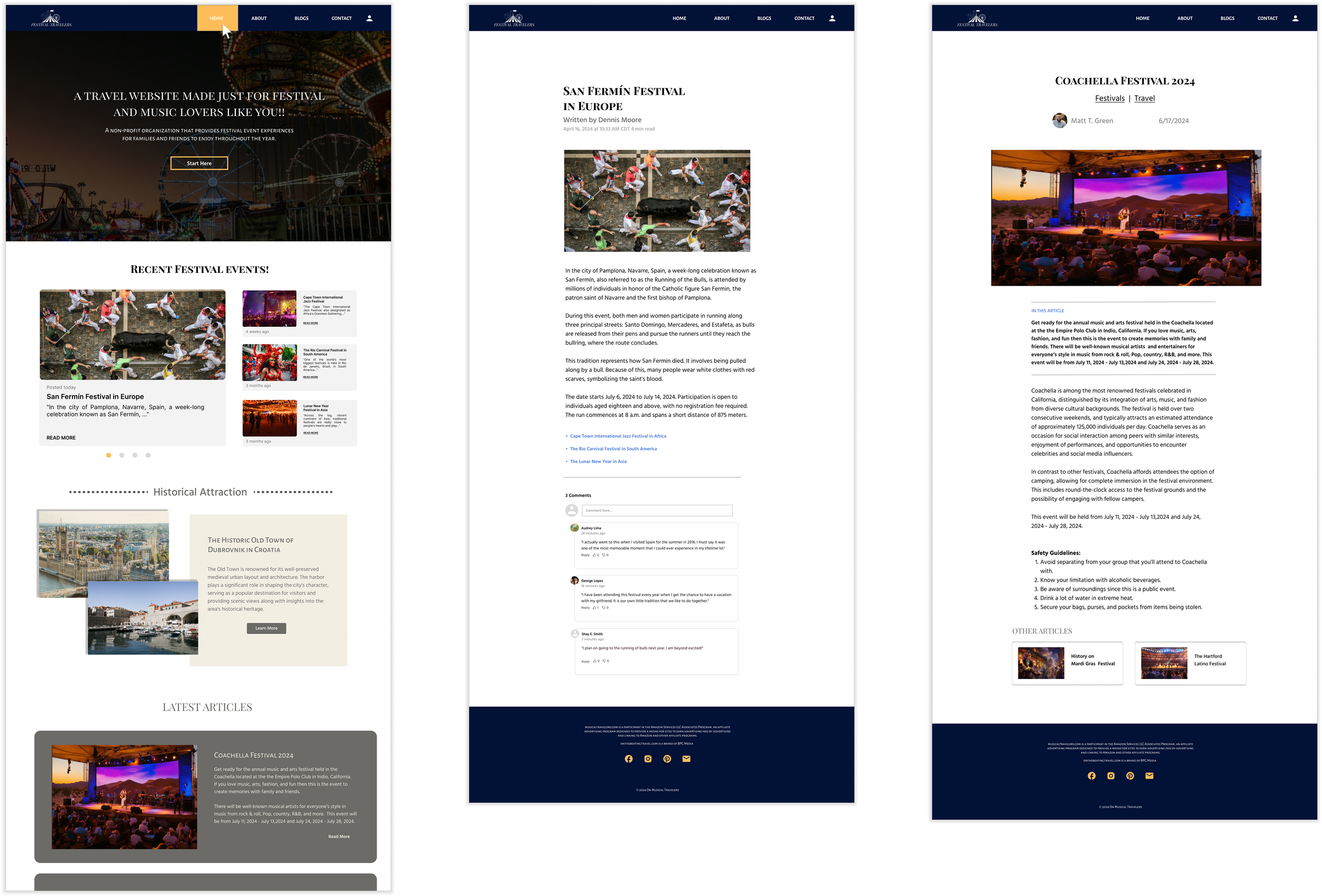
Since the website was simplistic in its layout design, I wanted to incorporate unique layers in each section for the Home page to grab the attention of the audience. For the new design, I proposed overlapping two distinct pictures of The Historic Old Town of Dubrovnik in Croatia with a brief summary to engage the users to read more about the topic by hitting the “Read More” button.
I developed a sitemap diagram illustrating the architecture that would structure the website for better organization and integrating elements from the original website design while maintaining a seamless experience for the users to navigate as a way to prevent being overwhelmed with content.
Festival Travelers’s Word Cloud
The original website was unorganized and appeared to be repetitive. Wireframes were developed to reconstruct the website for better organization, navigational flow, more visual appeal, and content categorization from the initial design to an upgraded design layout.
Wireframe
Navigation bar (Hamburger menu)
The original website navigation bar consisted of: Start Here tab, Festivals tab, Travel tab, and the About tab. But there was instant confusion since the Start Here tab navigated to a page that appeared to be a (second) homepage. The About tab had subtabs of Blog and Brand Partnership links, which had no correlation with Festival traveler’s overall theme. It was concluded to make adjustments to the navigation bar tabs to Home tab, About tab, Blogs tab, and the Contact tab.
Home page
The original website seemed to have two home pages. This could cause confusion for users all around. It was apparent to combine both homepages into one and summarize portions of both pages so that it wouldn’t be overwhelming for users to read and understand each topic.
The overall design of the homepage was influence by two popular web service providers: Yahoo.com and AOL.com since Festival Travelers had similar ways of advertising users’ passions in regard to events, news, and information that is informative. This is why a gallery was suggested to include for the home page.
Since the website was simplistic in its layout design, incorporating unique layers in each section for the homepage gave a sense of variety of displays to grab the attention of the audience. One example is overlapping two pictures of two distinct views of The Historic Old Town of Dubrovnik in Croatia with a brief summary that may want a user to hit the “Read More” button, to read more.
Category pages
The original website had two category pages: the Blog page and Festival page. The Blog page was the only category page kept with minor changes. The Festival category page was deleted and integrated into the redesign of the Home page.
Eleven article pages
The original website had eleven article pages which they had their alignments to the left of the page causing excessive white space on the right side of the page. I centered all the content which created a more balanced and visually pleasing look.
Blog page (The Best Earplugs for Festivals and Concerts)
The "Best Earplugs for Festivals and Concerts" webpage contained missing images, resulting in broken hyperlinks. Without the visibility of each product, a misalignment with their descriptions causing major white spaces. It was necessary to redesign the layout to ensure that each pair of earplugs was displayed aligned with its associated information.
Cart page
The original website lacked a contact page which was implemented in the new design layout for users to have direct communication to the Founder and Editor regarding inquiries, feedback, or concerns.
Mockup
IDEATE/DESIGNS
The direction I wanted was something that instantly grab the target audience’s attention with bright, fun, and bubbly design, layouts and colors. It was important to create visuals to align with the overall message of the company to develop a guaranteed and effective archetype of what the client, wanted to present to his target audience.
Visual system
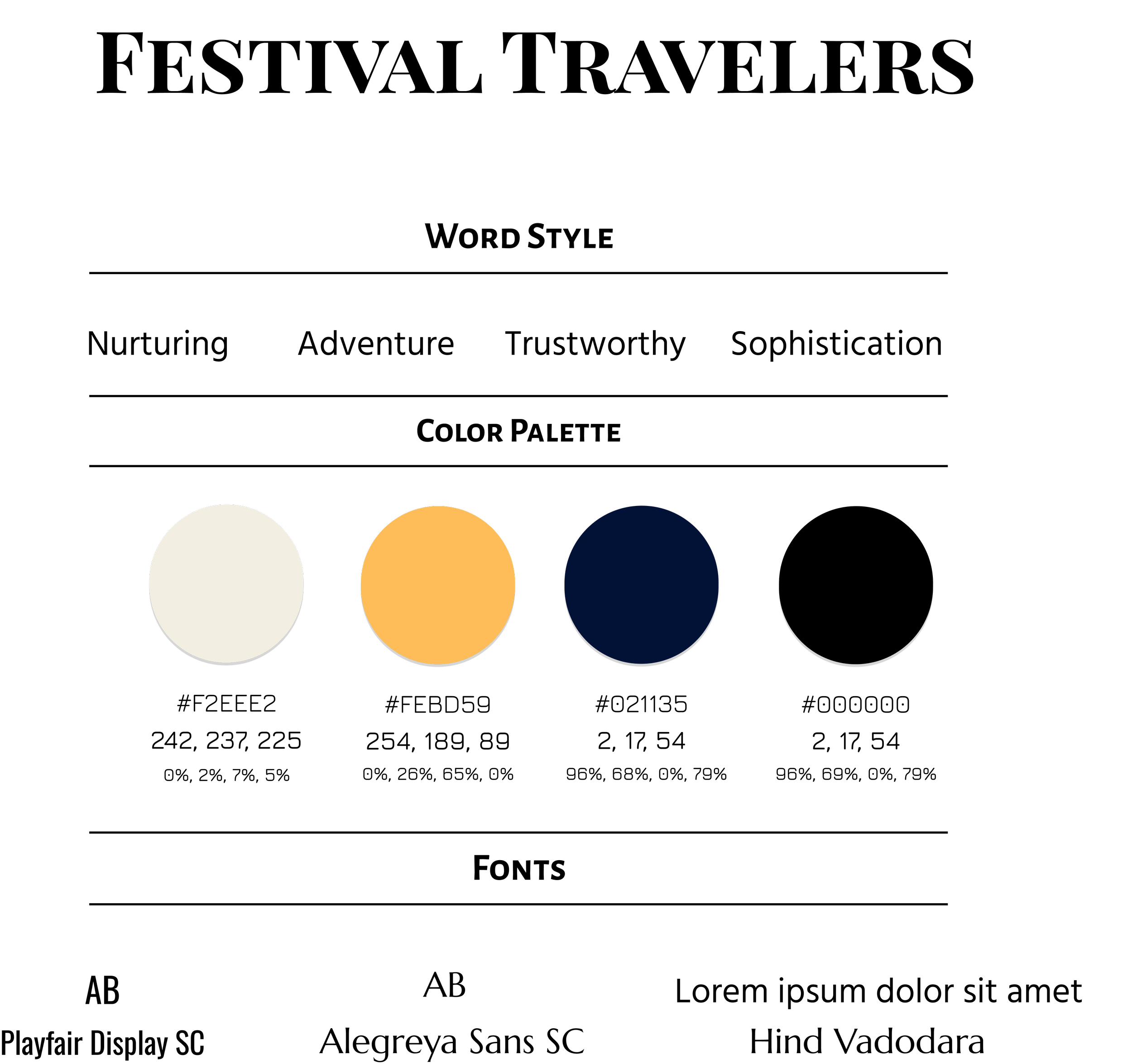
1. Color theme - The original color scheme was kept, using three neutral tones: tan, dark navy blue, and black, complemented by the color gold. This palette provided a balanced and cohesive layout, with the gold serving as festive ambiance through strategic use of harmonious colors.
2. Shape - None
3. Font theme - Sans-serifs are used for an approachable, clean, modern vibe
4. Pictures/illustrations - Tourist attractions, concerts, festivals, earplugs
5. Easy user-interaction effects - Drop down menu, hover effects, and filters
Segment - 2025
PROTOTYPE
Home page
Upon entering the website, a visual background of a festival-themed image overlayed with a semi-transparent black layer is displayed along with a title, subtitle, and the “Start Here” button, which allows anyone to create an account for a more personal experience, specifically when commenting under posts or other user’s comments.
When users scroll to the "Recent Festival Events" section, a gallery of events where users can transition to different topics by hitting the pagination dots. Also, users can select any festival topic by clicking on its associated title, image, or the “Read More” hyperlink, which navigates to a dedicated page with detailed information about that particular selected festival. Users can now submit comments beneath posts and engage with other users after establishing an account with Festival Travelers.
The next section is called, “Historical Attraction,” which shows two pictures of the attraction and gives a brief overview about a historic town called Dubrovnik in Croatia. Users have the option to read more about the city once they click on the “Learn More” button, which will navigate them to a new page that has more information about the Dubrovnik.
The Latest Article pages
Users have the option to access various festival stories by selecting the "Other Articles" section located beneath one of the articles they initially choose to read within the "Latest Articles" section on the homepage. When the cursor hovers over a specific festival article, the shading darkens, indicating selection; clicking on this option will direct the user to the corresponding detailed page of that festival.
Blog pages
he Blogs page is organized into four distinct topics. Once the user hovers the cursor over a topic's title, an underline is rendered beneath the text, and the background color transitions from light gray to a darker shade. Clicking on the associated image, title, or "Read More" link directs the user to the respective detailed content page.
TESTING
Final Step: Personal website did make a positive impact with users
Segment - 2024
The final assessment involved a customer analysis software to monitor customer traffic for the next three months. This analysis would serve as an indicator of the users' satisfaction with the company’s personal website and overall experience.
BEFORE - Engagement Rate (20%)
Mark T. Green’s website lacked engagement rates, user interests, and interactive behaviors three years after the platform launched in 2017. He noticed that it became stagnant during 2020 with a slow growth of 20%, and only 360 users per month were actively engaging on his website.
AFTER - Engagement Rate / Click-Through Rate (30% increase)
Since the new design of the website which now includes more engaging interactions and other functional elements such as links that goes to that specific page has increased customer’s engagement rate by 30% within three months, confirming that the quality of the new design.
BEFORE - Unique Viewers
Mark T. Green had lack of his users’ interests in only attracting 1,000 unique viewers per month from the lack of visual appeal and was poorly organized.
AFTER - Unique viewers (30% increase)
Once the redesign and modification of his website was finalized, there was a 30% increase of unique visitors and views each month.
REFLECT & GROWTH
The purpose of this project was to assist Mark in influencing users to spend more time and interact more with his website. The problem that needed to be solved was the website lacked organization to the corresponding pages, had uninteresting visuals, and lacked special features to make the website more appealing. I improved the website by making it easier to navigate, updating the look with attractive, high-quality pictures, and adding special features.
During my research, I conducted a questionnaire-based interview with twelve customers. An empathy map was also incorporated into the research to help me understand the perspective with people that use Festival Travelers. Additionally, word cloud was used to visualize the common theme that participants expressed as an overview to develop a new concept for a new design. After I conducted my research, I notice the pattern that many participants expressed how dull, unorganized, and unappealing the website appeared to them. They expressed wanting to feel excitement when knowing that a particular event will be coming soon. So, it was important to create an ambiance that represented excitement, fun, adventure, and curiosity.
Better quality pictures were included, a gallery for main articles were included, and special effects where it makes things interactive and more convenient for users when navigating through the website. But what I could have done differently was create a survey to give to the users for their final thoughts and opinions on the new website design. This could have given me more of a transparent overview of their experiences and a possible influence in making minor adjustments to the website. Videos of festivals presented on the website could have been incorporated for those who wanted a better visual representation of each festival they were reading. This would have allowed them to truly be digitally immersed in the culture with the types of songs, dances, and performances that are played in each country.
This process taught me that theme has to match emotions which should be conveyed to customers. It’s also important to find a strategic plan like improvising during deadlines that has been established to develop a new visual presentation. Mark T. Green had events that would interest those who wanted to go to a particular concert or festival, but his website was dull and simplistic with topics not aligned with their directive pages. Once participants confirm their experiences using the website, changes were made with better organization, better visuals, and more engagement. After using the customer analyses software to monitor the overall results, it was concluded the new design's effectiveness, elevating the brand's quality, resulting in a 30% increase of customers’ interest and engagement.


