


Responsive Website
Beauti & Bold
Michelle Scott Ling’s online makeup store offers products for all skin tones, from subtle to bold, along with tools to achieve a flawless, effortless finish.
SUMMARY
The concept of this project was to address challenges related to low customer purchases for Beauti & Bold's online cosmetics store. The lack of high-quality professional pictures, visual appeal, and social proof had negatively impacted customers’ concerns on its authenticity about the brand, which caused stagnation in customer engagement.
As a result, the website now features enhanced user interactions, showcases entertainers and influencers using Beauti & Bold products, video reviews of customers applying Michelle’s makeup, and displays of high-quality images of her products. {Although, we did not reach the goal of 15% within 6 months, we were still able to increase customers by 12%.} These improvements have positioned the brand as high-quality, resulting an increase of customer sales from the recovery of previous investment losses.
Role: Web Designer (UX/UI designer)
Timeline: 8/19/2024 - 10/20/2024
Tools used: Figma & Analysis tool
CONTEXT
Former R&B singer Michelle Scott Ling launched her small cosmetic line in September 2022. The objective of Beauti & Bold was to create a distinctive brand to attract those who enjoy quality makeup products at a more affordable cost.
However, she observed that lack of customer engagement and stagnation in customer sales did not meet her expectations over time.
PROBLEM
The website lacked visual appeal that was displayed which negatively affected the user experience, it wasn’t captivating, or engaging which caused the lack of customer investment.
MY ROLE
As a Website Designer, I was hired to enhance the visual appeal and overall experience of a small cosmetic online website called, Beauti & Bold.
My goal was to find ways to attract more consumers and boost customer purchases by 15%, while aiming to connect with her target audience.
SOLUTION
The solution is to identify the target audience and use good design strategies by revamping the overall website and include informative content, customer reaction videos, and social proof elements. This will boost customer engagement and build trust, leading to increased customer sales.
Interview Questionaries
Competitor analysis
Journey Map
UX SWOT Analysis
Customer analysis software
To get data for the best results to solve this problem I used:
Emphasize → Analyze/Research → Ideate/Design → Prototype → Test → Reflect/Growth
Breakdown of the process:
EMPATHIZE
Michelle Scott Ling lacked the understanding of what the customers expected to see once surfing through the website. She needed to foster a sense of connection with her target audiences by integrating her background as the founder of Beauti & Bold. Also, placing emphasizes because of the lack of representation of how her products would look on different shades of skin tone lacked inclusivity of anyone that would be interested in buying her makeup products.
ANALYZE/RESEARCH
Questions that were asked regarding makeup:
Do you prefer to purchase makeup products online or in retail stores? if not, why?
What are some problems when trying to find the best makeup options?
What matters most to you when buying a makeup product?
Have you bought makeup products from independent small cosmetic brands?
During my research, twelve random people from ages 18-33 were interviewed with questionnaires to gain insights and perspectives about the Beauti & Bold website and overall views on makeup.
I targeted people from different professions such as models, makeup artists, beauty influencers, actresses, medical professionals, as well as everyday individuals who enjoy wearing makeup for various occasions such as dates, special events, weddings, and work.
Insights: General Responses about How Individuals Choose Makeup
1. Most individuals prefer buying makeup in retail stores than online stores. This is due to the availability of small samples that allow customers to test, compared to online shopping, which is riskier.
2. The majority of twelve participants expressed problems when certain products don’t have ingredients that are hypoallergenic for their sensitive skin. They also mentioned that some products seem old, making the formula clumpy or super dry, which affects their usability.
3. A survey was conducted and what mattered the most was the color (56%), the quality (54%), and the price value (49%). https://blog.fieldagent.net/a-primer-on-cosmetics-500-women-talk-makeup-shopping-usage-survey
4. Out of the twelve who were interviewed, ten said they do not normally buy products from small independent cosmetic stores because of the lack of makeup options. Two of the interviewers said there’s a lack of advertisement for small cosmetic business to be noticed by the public.
56%
People felt that color is the most important when choosing makeup.
54%
People felt that the quality of the product is the most important when choosing makeup.
49%
People felt that the price is the most important when choosing makeup.
Questions that were asked regarding Beauti & Bold website:
Did you buy any makeup items from the Beauti & Bold website? Why or why not?
Would you come back to this website if you wanted to buy any more makeup?
What made you buy one and/or many of Beauti & Bold’s products?
Would you recommend family, friends, coworkers, or acquaintances to buy any makeup items from the Beauti & Bold’s website?
Insights: Negative Feedback of Beauti & Bold’s Underwhelming Website Presentation
1. Three participants decided to leave the website under 2 minutes. One said that it was underwhelming plain in presentation. The other seven participants bought a product even though they were apprehensive from how underdeveloped the website appeared to be to them.
The last two individuals decided to not buy any products, Khloe stated, “So far the way that everything looks doesn’t have me interested in buying any products on this website.”
2. Seven participants appreciated the prices on the makeup but said they wouldn’t revisit the website. The other five said they would if the overall quality of the website was presented more professionally.
3. Seven of participants decided to do research on Beauti & Bold's cosmetics before buying Michelle’s makeup products. During their research they discovered an Instagram, TikTok, and Facebook had of her fans supporting her makeup. This led them to make a purchase.
4. The majority of participants during this research said that they would not recommend their family and friends to this website. Only two participants said they would recommend it because of the prices, but it needs improvement.

Name: Khloe Connor
Age: 26
Location: Springfield, MA
Occupation: Registered Nurse
Education: Master’s degree
Hobbies: Loves to do Pilates
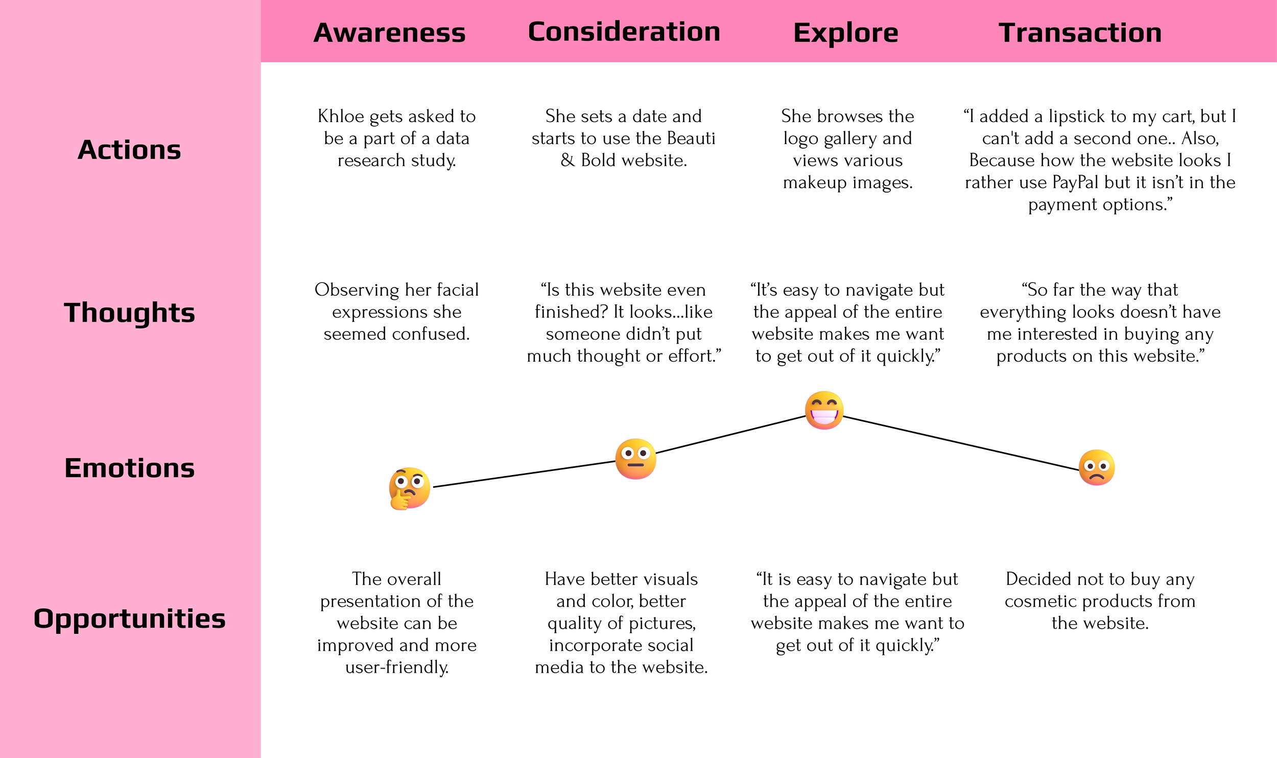
Khloe Conner was one of the candidates who participated in the questionnaire. I observed her overall response to the process, and notice that she was one of the few people who was the most straightforward in expressing her thoughts, feelings, and perspectives.
Beauti & Bold’s Journey Map
A comprehensive analysis was undertaken comparing Beauti & Bold with two other small cosmetic online businesses Karysha Cosmetics and Prados Beauty. The goal was to identify key elements that could provide insights for enhancing the Beauti & Bold website.
Competitor Analysis
Competitors


Home page
Prados’s home page showcases visuals appealing layout of their makeup products.
Beauti and Bold’s home page isn’t aesthetically appealing with low-quality pictures.

The home page on Karyshia Cosmetics had a visually appealing layout of their makeup products.
About page
Beauti and Bold does not an about page to talk about the background story of the company.
Karyshia Cosmetics’s about page is visually appealing but repetitive in its company’s history story.
Prados’s has background story of the CEO and two collaborators that is a part of the company.
Product page
Beauti and Bold has various of cosmetic options for lips, eyes, and face.
Karyshia Cosmetics’s website specializes in glitter makeup for eyes, lips, and body.
There are a few makeup options for users to choose to buy from on Prados website.
Beauti & Bold’s UX SWOT Analysis
A SWOT analysis was used to identify the company’s strengths, weaknesses, opportunities, and threats. I developed strategies that offered a competitive advantage with Michelle’s competitors.

STRENGTHS
There’s a wide range of makeup to available to choose from.
There are affordable price ranges for customers to buy.
Most images were screenshots using an iphone which caused the products to look unprofessional.
There are limited payment options for customers to make purchases.
There’s a lack of customer reviews which cause users to undermine its credibility as a company.
WEAKNESS
Models wearing Beauti & Bold makeup products with a variation of skin tones will help customers see how the colors and enhancements, such as eye lashes might look on them, so they feel more included, accepted and validated.
Include videos featuring credible sources like influencers and entertainers wearing the makeup.
Include reviews of everyday individuals wearing Beauti & Bold’s makeup.
OPPORTUNITIES
The lack of social proof, customer reviews, and company’s history creates doubts about reliability of the Beauti & Bold’s brand.
There are other cosmetic online brands that have better visual appeal, customer reviews, and better customer engagements.
Beauti & Bold does not have a strong brand to convey a message to their target audience.
THREATS
Original Website Overview: Branding and Website Reconstruction
The original website did not have a background narrative, resulting in a lack of understanding the company’s identity, journey, goals, and objectives to convey to its customers.
It was concluded to reconstruct the visual appeal of the entire website and address the narration of Michelle and her cosmetic line website.
I knew I had to remodel the entire home page which was the “Product” page and renamed it to “Home” tab. A “Makeup” tab was added with the other navigation tabs. So, when customers navigate to the “Makeup” tab, they can explore more cosmetic options.
This makes it easier, and it saves time for customers to find their specific products that they are looking for and it prevents them from being overwhelmed with clutter.
Also, it was advised that my client have high-quality professional images of her the products, to give a sense of legitimacy which would give a sense of trust for the customers to buy products.
My client Michelle was informed that the links at the bottom of the page should be changed to include important information like privacy policies and terms of use, which are required by law. Also, I suggested to add a sign-up option so customers can receive email updates about new makeup products or upcoming discounts. Also, it was important to include her social media links, so she can promote her cosmetics there.

There were 25 to 34 different layouts created for the desktop, tablet, and mobile design, highlighting specific sections of each option with red rectangles. After identifying these key areas, the final layout was outlined in yellow rectangles. The website design needs to engage customers while effectively ensuring a user-friendly layout.
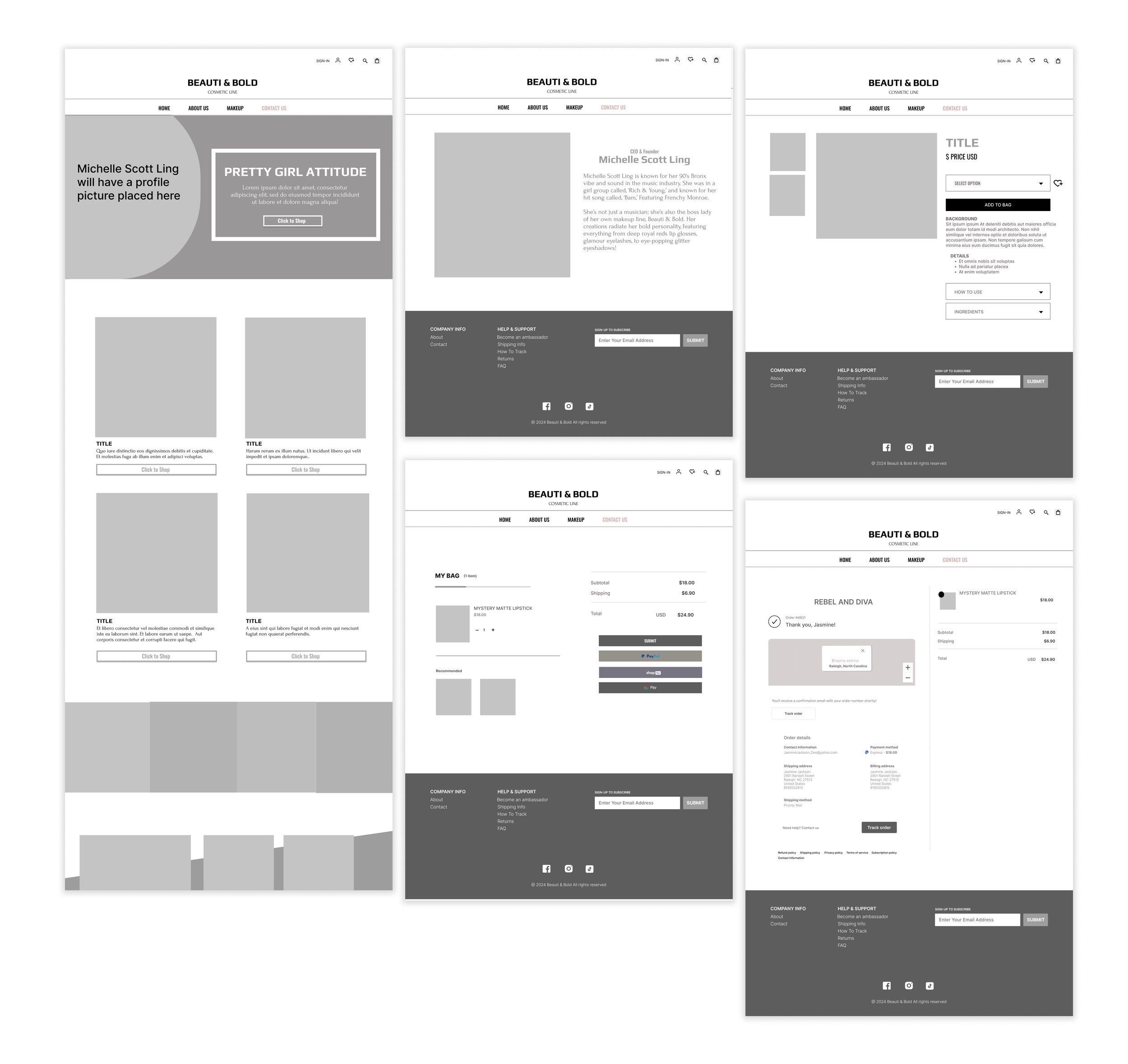
Wireframe

Home page
This was the final draft of how the website would look. Upon accessing the website, the 12 images were substituted, from the old website design, with four images that will be high-quality to showcase previews of the products that she wanted to emphasize more to her audience if they decide to navigate to that specific product’s page that they want to review.
About page
An “About” page was included in the final website design to provide an overview of Michelle Scott Ling's background as a former R&B singer, her transition into entrepreneurship, and the mission of her cosmetic online business. This section allows the audience to understand the brand and establish a personal connection with Michelle.
Cart page
The cart layout was redesigned and updated so customers can have the ability to adjust the quantity of the item they wish to purchase. A “Feature Section,” has been incorporated beneath the cart, which previews other products that customers may be interested in purchasing during their next visit on website.
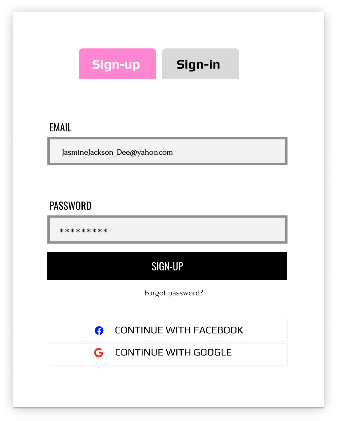
Sign-up/Sign-in account page
It was important to include an account for customers to create which allows them to log in easily whenever they visit the website. When a customer has an account, they are able to save products they placed in their wish list for future purchases, be notified for special perks or new launches, and view history of past products they ordered. This makes it faster and easier for them to buy the same products again or find what they need without browsing through the entire website each time.
Receipt page
Finally, to enhance the overall website experience, we have introduced a tracking feature. Many e-commerce websites have successfully implemented this strategy, which allows customers to track the location of their purchased products and contributes to a more professional and convenient experience.
Mockup
IDEATE/DESIGNS
The direction I wanted was something that instantly grab the target audience’s attention with bright, fun, and bubbly design, layouts and colors. It was important to create visuals to align with the overall message of the company to develop a guaranteed and effective archetype of what the client, wanted to present to her target audience.
Visual system
1. Color theme - Pink can mean nurturing and compassion. The color black can mean elegance and professionalism. The last color white can mean honesty.
2. Shape - None
3. Font theme - Sans-serifs are used for an approachable, clean, and a more modern vibe
4. Pictures/illustrations - Models, Influencers, makeup products, and supplies
5. Easy user-interaction effects - Play or pause a video, hover effects, and a tracking feature


PROTOTYPE
Home page
Four images that will be high-quality to showcase previews of the products that she wanted to emphasize to her audience.
A “Click to Shop” button, allows customers to navigate directly to the specific product page for further details or to purchase.
Cart page
Customers can now have the ability to adjust the quantity of the item they wish to purchase. They can remove the item from their cart by hitting the X button that is placed on the right side of the item or choose to retain items in the cart to purchase by hitting the undo arrow.
Sign-in/Sign-up account page
Users can now create a personal profile account, by selecting the profile icon located in the navigation bar. Once they are log-in, they can proceed to add items to their wish list or favorites list, or in their shopping cart when they want to purchase.
Once they are log-in, they can proceed to add items to their wish list or favorites list, or in their shopping cart when they want to purchase.
Receipt page
Customers can track the location of their purchased products by hitting the “Track Order,” button which the map will zoom in the current location of where the product resides.

TESTING
Final Step: The Redesign Helped Improve Sales and Customer Engagements
The last step was to use a customer analysis software to monitor and evaluate the six-month timeline and to compare any positive changes in customer sales and engagement following the redesign of the Beauti & Bold website.
The results indicated a positive increase in customer sales following the redesign of the Beauti & Bold website. The enhancements in visual appeal, user experience, high-quality professional images of the products, and the diverse representation of models, along with reviews from entertainers, influencers, and everyday users, contributed to a sense of legitimacy which gave a sense of trust for the customers to buy products for this small online cosmetics business.

A pop-up could have been implemented to display discounts, special offers, and subscription options for future deals when someone first visits the Beauti & Bold website.
Customer comments and star ratings could have been added regarding their personal opinions of Beauti and Bold products and services.
What could I have done differently?
REFLECT & GROWTH
What I have learned through this process was presentation is crucial, especially when it comes to an establishment. By having good presentation, it can help attract connections and foster relationships with professional networks. Also, it can enhance credibility and gain trust with a target audience. Beauti & Bold is the perfect example, even though Michelle Scott Ling had a strong concept of having high quality products for an affordable price, her website's visual presentation was underwhelming, coupled with a lack of credible customer reviews and low-quality images. These factors contributed to a stagnation in customer population and possibly caused hesitation with new potential customers to make a purchase, as evidenced shown by the feedback from the 12 participants surveyed during the website evaluation interview.