

TYPE PALETTE:
Anton
Outfit
Knewave
Digital Specifications: sRGB Color Space | 72 PPI | PNG | 1080 x 1350px (Optimized for Web)
Print Specifications: CMYK Color Space | 300 DPI | 100lb Matte Coated Cover Stock | 18" x 24" with 0.125" Bleed
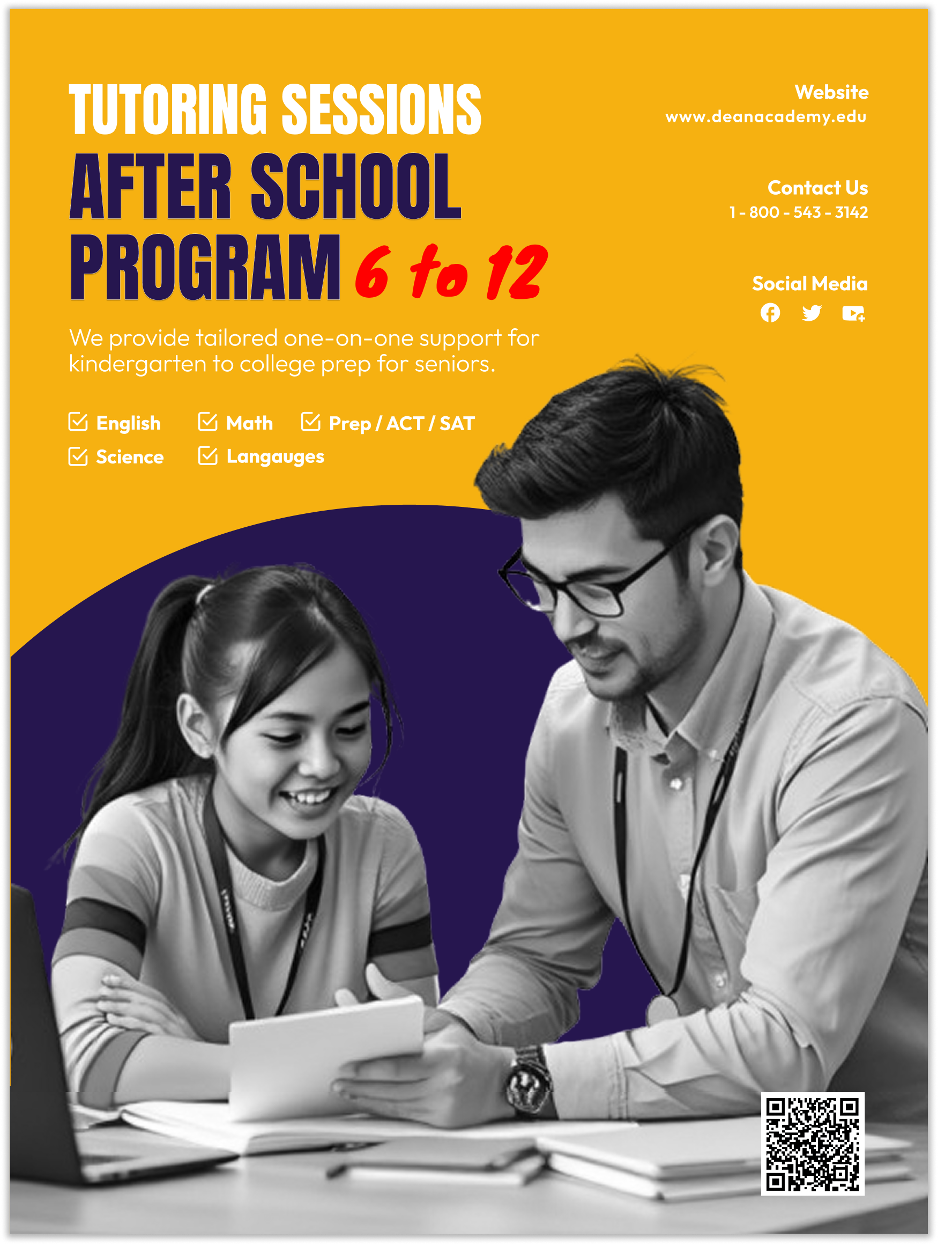
DEAN ACADEMY TUTOR PROGRAM POSTER
BRIEF CONTEXT:
Brand identity & promotional campaign for
Dean Academy’s wanted to promote their tutoring program for grades 6th to 12th graders for premium 2026 academic support series. The project focuses on marketing high-impact tutoring services for students from kindergarten through senior year.
THE PROBLEM:
The challenge was to convey a sense of professional authority and support to teen kids.
SOLUTION:
A high contrast "A solid gold background with deep navy blue and white typography, the design establishes immediate trust. Since most professional poster printers cannot accurately print color gradients, solid colors were used since it was more reliable for ensuring the final print.
The visual focus remains on the interpersonal connection of a male tutor working one-on-one with a student to humanize the professionalism and support.
THE RESULTS:
The Result (e.g., 15% increase in engagement).
TYPE PALETTE:
Anton SC
Allan
Big Shoulder Display

Digital Specifications: sRGB Color Space | 72 PPI | PNG | 1080 x 1350px (Optimized for Web)
Print Specifications: CMYK Color Space | 300 DPI | 100lb Matte Coated Cover Stock | 18" x 24" with 0.125" Bleed
TOPANGA’S RED RASPBERY CHEESECAKE ICE CREAM POSTER
BRIEF CONTEXT:
Topanga’s Ice Cream had a new flavor they wanted to promote to the public. This new flavor was a cheesecake-raspberry ice cream with a caramel peach whip cream on top. Aiming to delight anyone’s palette that like that sweet-savory flavor.
THE PROBLEM:
The challenge was to visually convey the new ice cream flavor's taste without cluttering the design.
SOLUTION:
I achieved this by strategically positioning clear, concise information about each ingredient that the ice cream consisted of. Also, I chose vibrant colors that reflected the ingredients in the ice cream, and adding a few red raspberries “dropping down” into the poster. Last, I made the title of the flavor standout even more which was in sequence of the raspberry-cheesecake theme of the poster. These little touches instantly catch the eye of anyone walking by, making the whole design really inviting and eye-catching!
THE RESULTS:
The Result (e.g., 15% increase in engagement)..
TYPE PALETTE:
Anton
Antonio
Actor
Digital Specifications: sRGB Color Space | 72 PPI | PNG | 1080 x 1350px (Optimized for Web)
Print Specifications: CMYK Color Space | 300 DPI | 100lb Matte Coated Cover Stock | 18" x 24" with 0.125" Bleed
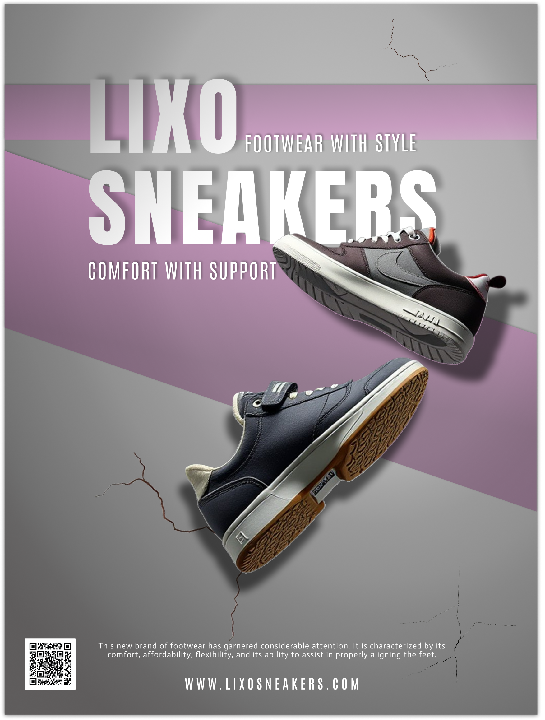
LIXO SNEAKER POSTER
BRIEF CONTEXT:
Visual identity and launch campaign for Lixo,
A new brand of shoes that specializes in style and comfort." The brand focuses on ultra-lightweight materials paired with orthopedic-grade support that will look good for any age group.
THE PROBLEM:
Because Lixo is a new show brand being promoted, it was important to create a design that was instantly eye catching especially while in competition with already established shoe brands.
SOLUTION:
"This poster has an urban, city-inspired look. The background has a concrete texture to highlight the street vibe. while two smooth, purple-colored ribbons swirl across the poster to add energy and movement.
On top of the purple gradient ribbons is the brand’s name, ‘Lixo Sneakers,’ are big and bold with a smaller subtitle placed next serving as descriptive text emphasizing primary benefits.
Above the brand name, “Lixo Sneakers,” the text is prominently displayed in a large, bold font, accompanied by a smaller subtitle positioned adjacent to it, serving as a descriptive element that emphasizes the key benefits.
There are two realistic 3D shoes placed off-center to catch your attention. Shadows behind the shoes give a sense of depth and make it seem like a light is shining on them, helping your eyes flow naturally to the main message and calls to action.
At the bottom, there's a short phrase that explains why the shoes are great, followed by a big, clear website address to encourage people to buy.
THE RESULTS:
The Result (e.g., 15% increase in engagement).
TYPE PALETTE:
Black Ops One
Audiowide
Rosario
Digital Specifications: sRGB Color Space | 72 PPI | PNG | 1080 x 1350px (Optimized for Web)
Print Specifications: CMYK Color Space | 300 DPI | 100lb Matte Coated Cover Stock | 18" x 24" with 0.125" Bleed
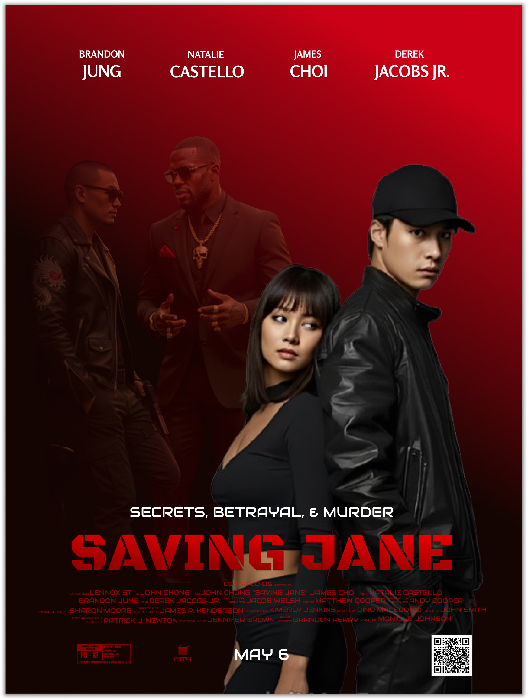
SAVING JANE MOVIE POSTER
BRIEF CONTEXT:
Visual identity and promotional rollout for "Finding Jane," a 2026 psychological thriller. The campaign centers on the film's "Twin-Turn" narrative, where a woman discovers her mirror self living an identical, sinister life.
THE PROBLEM:
The challenge involved designing a poster that conveys a sense of mystique by minimize explicit information, thereby encouraging viewers to interpret and infer its meaning independently.
SOLUTION:
A “Symmetric Distortion” visual theme was implemented by using two figures in the background, representing hidden, perhaps darker motives. The two characters that are bigger, are the focal point. The duality and psychological theme of the poster give opportunity and encourages viewers to interpret its meaning independently.
THE RESULTS:
The Result (e.g., 15% increase in engagement).
TYPE PALETTE:
Anta
Fahkwang
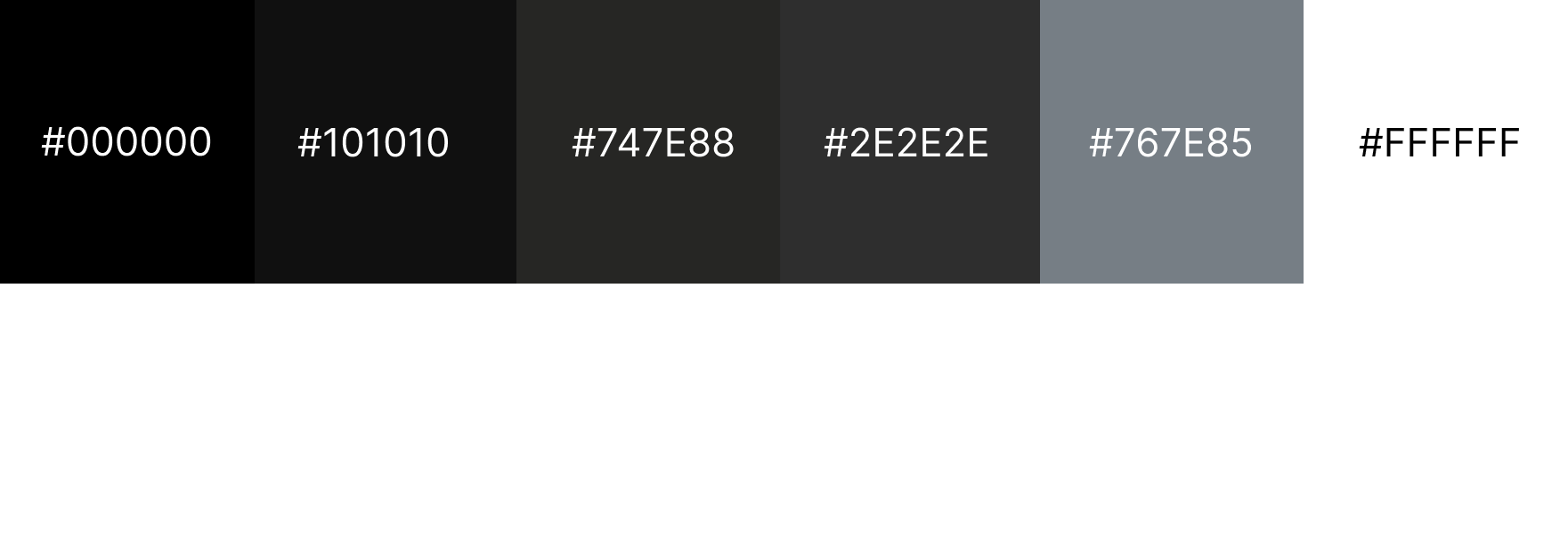
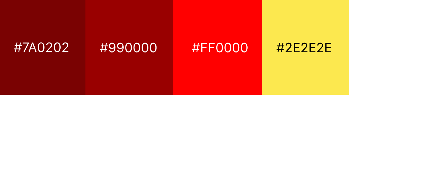
COLOR SCHEME:
Digital Specifications: sRGB Color Space | 72 PPI | PNG | 1080 x 1350px (Optimized for Web)
Print Specifications: CMYK Color Space | 300 DPI | 100lb Matte Coated Cover Stock | 18" x 24" with 0.125" Bleed
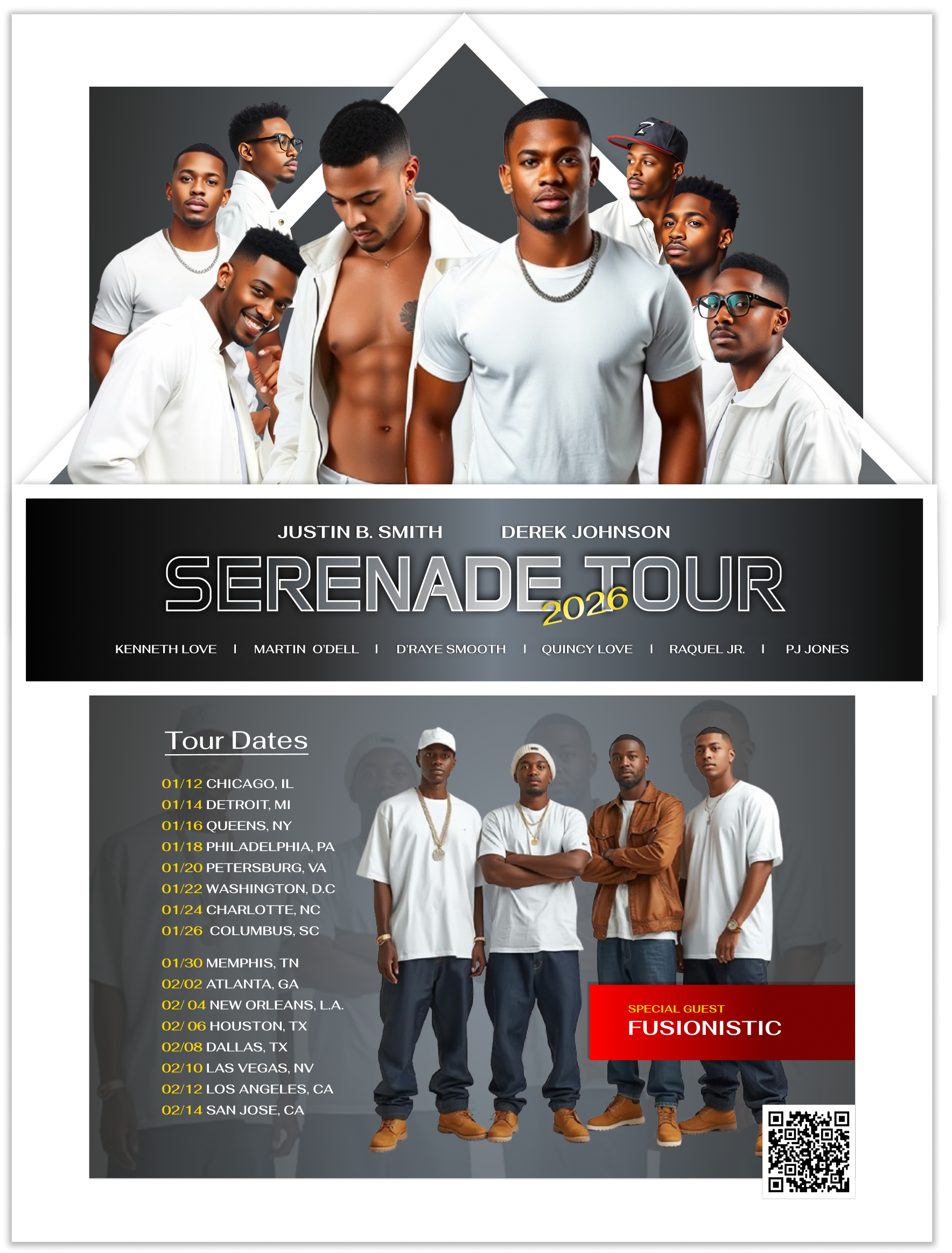
SERERENADE TOUR - 2026 CONCERT POSTER
BRIEF CONTEXT:
Visual identity and promotional campaign for the "SERENADE TOUR 2026," a high-profile R&B concert series held exclusively on university campuses. The tour features a lineup of major contemporary R&B artists tailored for a student demographic.
THE PROBLEM:
Most concert posters for campus events look like generic flyers, failing to capture the "prestige" of a major tour or the smooth, intimate aesthetic of R&B music. R&B branding often leans into clichés of red roses or soft lighting, which can feel dated and fail to stand out in a cluttered campus environment.
SOLUTION:
"Monochrome High-Contrast" theme. By using a heavy gray gradient background, the design creates a sophisticated, with a futuristic atmosphere. Strategic pops of yellow and red are used to draw the eye immediately to the most critical information—the year, the dates, and the special guest artists—ensuring high readability and visual impact from a distance.
THE RESULTS:
The Result (e.g., 15% increase in engagement).
TYPE PALETTE:
Black Ops One
Audiowide
Rosario


Digital Specifications: sRGB Color Space | 72 PPI | PNG | 1080 x 1350px (Optimized for Web)
Print Specifications: CMYK Color Space | 300 DPI | 100lb Matte Coated Cover Stock | 18" x 24" with 0.125" Bleed
SAVING JANE MOVIE POSTER
BRIEF CONTEXT:
Visual identity and promotional rollout for "Finding Jane," a 2026 psychological thriller. The campaign centers on the film's "Twin-Turn" narrative, where a woman discovers her mirror self living an identical, sinister life.
THE PROBLEM:
The challenge involved designing a poster that conveys a sense of mystique by minimize explicit information, thereby encouraging viewers to interpret and infer its meaning independently.
SOLUTION:
A “Symmetric Distortion” visual theme was implemented by using two figures in the background, representing hidden, perhaps darker motives. The two characters that are bigger, are the focal point. The duality and psychological theme of the poster give opportunity and encourages viewers to interpret its meaning independently.
THE RESULTS:
The Result (e.g., 15% increase in engagement)..